Showing 10 of 12 Blog Posts

Using charts to represent your numerical or statistical data helps your audience understand everything visually at a glance. In this new Google Slides tutorial, you’ll learn how to...

What is an infographic presentation? Maybe the word “infographics” rings a bell. Indeed, companies make use of this sort of depiction, but what are they? In essence,...
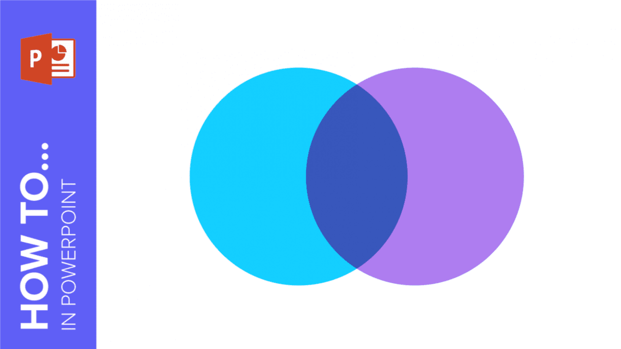
To help you with this matter easily and quickly, in this GreatPPT School post we will explain how to insert or create a Venn diagram in PowerPoint, as...

One of the key challenges in presentations is effectively conveying data. To make the information more engaging and easier to comprehend, it’s recommended to use visual aids...

Infographics are diagrams designed to visually present information. Whether you're a teacher, student, marketer, or startup owner, GreatPPT offers a wide selection of free diagrams to enhance...

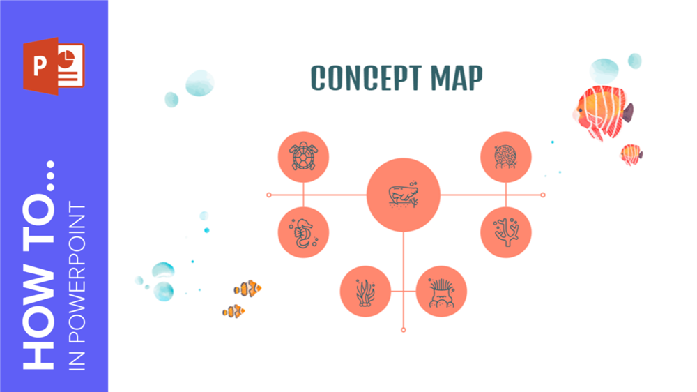
Mind mapping is an excellent technique for visually learning a series of concepts, ideas, or information. These mind maps resemble hierarchical diagrams with branching structures that should...
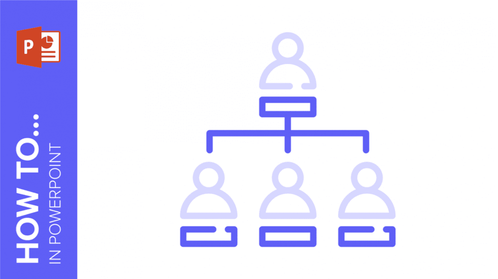
With PowerPoint, there are two primary methods to create an organizational chart, we will provide step-by-step instructions on both methods in this tutorial.

Timelines can be created in a wide range of colors, formats, and styles. While there are numerous creative approaches to designing them, they generally consist of a...
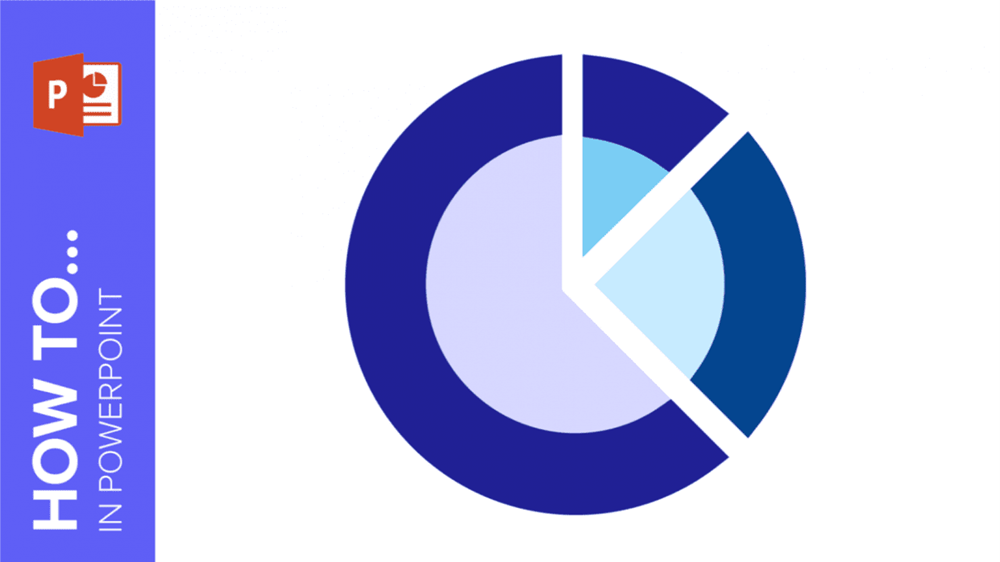
If you're seeking to enhance your presentations with diverse chart types, continue reading to discover how to create a radial chart in PowerPoint.
It’s estimated that 65 percent of humans are visual learners. That goes without saying that it is often easier to explain complicated concepts with visual aids than...