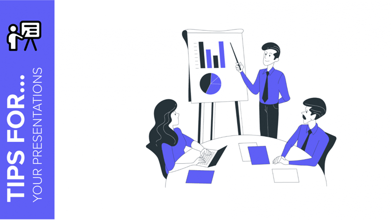
Giving a presentation in front of an audience to explain a project, an idea or a paper is not easy, but it shouldn’t be a bad experience either. With the help of these tips, you will learn how to give a great presentation in PowerPoint or Google Slides that is dynamic and able to capture the audience’s attention.
Summarize and structure your information
The presentation is only a visual aid to complement your presentation, so you don’t need to write the entire presentation on the slides. Most likely no one will read it, and in fact, including too much text is not very appealing to your audience. The best thing to do is to simplify it as much as possible.
To summarize your text, you can try including only concepts or keywords, using lists to display them.

Connect with your audience
Know your audience and tailor your presentation to them. Try to use the appropriate tone for each occasion. For example, if you are using a presentation to defend your thesis, choose a formal tone. On the other hand, if you are presenting your project to your classmates, a dynamic and interesting approach may be better.
You can try narrative techniques such as storytelling, which can help you explain your project by telling a story that is relevant to your audience.

Adapt the text
As we have already mentioned, you should not include too much text. However, it must be readable at a glance, so we recommend using a larger font.
Use a font that fits your theme. For example, if you are offering a promotional platform to attract new investors, use a formal typography. On the other hand, if your presentation is intended for kids, look for more interesting content.
Try not to use more than three different fonts. Remember that sans serif fonts are better for the screen. If you need to use a serif font, try to use it only when you need to show significant contrast in your presentation.

Choose fitting colors according to the theme
As with typography, color should adapt to the theme, tone and your audience. In fact, each color conveys a different concept or emotion. You will find many color palettes online that others have created, so these may be useful to you.You can also choose a free presentation template on GreatPPT.
Color can also help you categorize your content, making your message more attractive and harmonious.

Use graphs to show numerical data
If you want to display numerical data, it is best to use a chart. Again, we recommend using color to differentiate and compare data.
Choose a reasonable size so that your audience can understand everything without key or descriptive text. There are many different graphs: line graphs, bar graphs, bar charts, area charts, pie charts ……

Include timelines in your presentation
Another important tool when presenting projects is the use of timelines – infographics designed to show data over a specific period of time.
In your presentations, these graphical elements can help you show the evolution of your idea, product or different planning stages.

Choose relevant images for your presentation
Choosing the right images for your presentation is very important. We often say that a picture is worth a thousand words, and indeed, images can help you reinforce concepts and are the most effective tool for making an impact on your audience.
Make sure that all the images you include have a common style. Try to find quality images that are reasonably sized and discard those that look pixelated on the screen. Be creative and don’t rest on your laurels – avoid using the same images that others are using and focus on originality.

Animate your presentation
Animation allows different parts of the text to appear on the screen at different times, so you can take advantage of this when organizing your ideas.
In addition, adding transitions between slides can make your presentation more dynamic, highlight your main talking points and capture the attention of your audience. Make sure to use simple animations and try not to add them to every slide, or you’ll get the opposite result – your audience will get bored with them. For example, to compare two related pieces of information or to show a brand new product, you can try some nice effects such as Float In, Appear or Zoom.

Finally, you must remember that none of these will work unless you believe in your message. That’s the most important thing to achieve success and get your ideas across.Pp