Comparison Charts Infographics
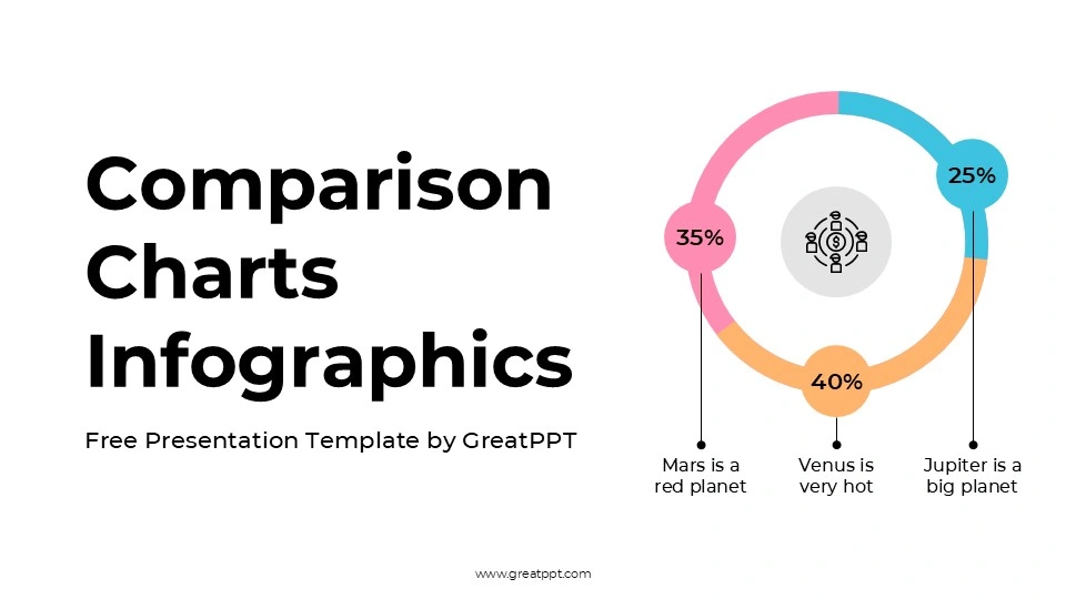
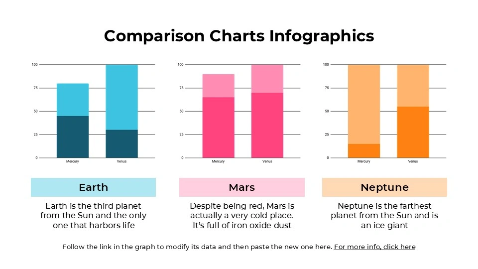
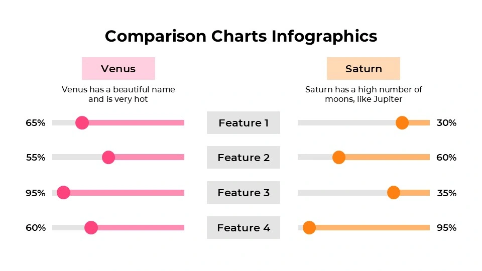
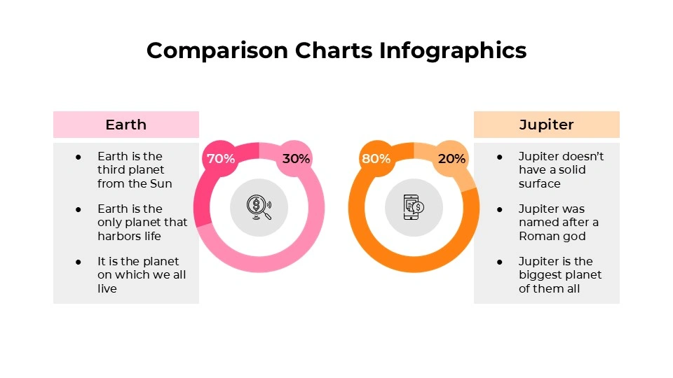
Comparison Charts Infographics
Free PowerPoint template and Google Slides theme
Most meetings reach a point where everyone just wants the “So What?” moment. You’ve presented the research, you’ve shared the background, and now the stakeholders are waiting for the punchline—which option is actually better? If you’re still trying to explain a side-by-side comparison with three paragraphs of bullet points, you’ve already lost the room.
The Comparison Charts Infographics for Google Slides and PowerPoint is built for the 2026 decision-maker. It’s a “no-fluff” toolkit designed to take the cognitive load off your audience and put the focus exactly where it belongs: on the choice at hand.
The Aesthetic: Surgical Precision
This isn’t a “pretty” deck for the sake of being pretty. It’s a high-performance visual engine:
The “Zero-Distraction” Palette: Utilizing a clean, corporate-modern mix of slate greys, deep navy, and high-visibility accent colors, it ensures that your data is the star of the show.
Modular Geometry: Every slide is built on a rigid grid. Whether it’s a Venn diagram, a “Pros vs. Cons” split, or a multi-tiered pricing table, the alignment is pixel-perfect to convey authority and meticulousness.
Functional Iconography: You get a library of minimalist, flat-design icons that act as universal shorthand for “growth,” “risk,” “features,” and “budget.”
Purpose & Strategic Use Cases
In a business landscape where “decision fatigue” is a real productivity killer, these slides act as a filter for:
SaaS & Vendor Benchmarking: Comparing the nitty-gritty of Feature A vs. Feature B without the sales fluff.
Quarterly Performance Reviews: Highlighting “Target vs. Actual” metrics in a way that makes the gap (or the win) immediately obvious.
Product Tiering & Pricing: Perfect for “Good, Better, Best” breakdowns that help customers (or executives) see the value of an upgrade.
Strategic Pivots: Mapping out “Path A” vs. “Path B” to visualize risk levels and resource allocation for the upcoming fiscal year.
Features of this template
- 100% editable and easy to modify
- 11 Different slides to impress your audience
- Contains easy-to-edit graphics such as graphs, maps, tables, timelines and mockups
- Includes 500+ icons for customizing your slides
- Designed to be used in Google Slides, Microsoft PowerPoint & Canva
- Includes information about fonts, colors, and credits of the resources used
Video Preview of Comparison Charts Infographics
Share Now!
Presentation Tips


Related Products
Same Contributor
Featured Products