People Infographics
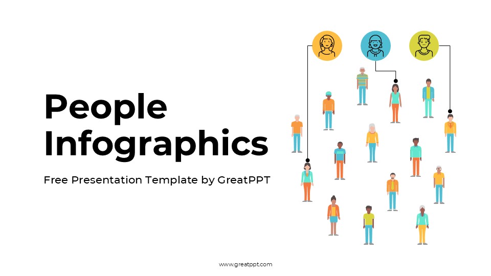


People Infographics
Free PowerPoint template and Google Slides theme
Data is just a collection of numbers until you put a human face on it. Whether you’re presenting a deep dive into consumer behavior, mapping out a new HR onboarding journey, or presenting sociological research to a lecture hall, you need visuals that resonate on an emotional level. You can’t tell a “people story” using cold, robotic bar charts.
The People Infographics Aesthetic template for Google Slides and PowerPoint is a masterclass in approachable data storytelling. It moves away from the stiff, “stock-photo” corporate look and embraces a modern, illustrative aesthetic that makes complex demographics feel accessible and inclusive.
The Aesthetic: Soft Palettes & Modern Minimalism
This isn’t your typical boardroom deck; it’s a Visual Dialogue. The design language focuses on “Empathetic Clarity”:
The “Warm Earth” Palette: Utilizing a sophisticated blend of terracotta, soft creams, sage greens, and mustard yellows. This muted, organic color story is intentionally designed to feel welcoming and grounded, avoiding the sterile “tech-blue” fatigue.
Inclusive Flat Illustrations: Featuring diverse human silhouettes and stylized characters that represent a broad spectrum of age, gender, and activity. These aren’t just decorations—they are visual anchors for your data.
Clean, Airy Typography: By prioritizing generous white space and soft sans-serif fonts, the template ensures your “Key Insights” breathe, making it easy for your audience to digest heavy information without feeling overwhelmed.
Design Logic: From Statistics to Stories
The structural logic behind this template is built on Humanizing Data Visualization:
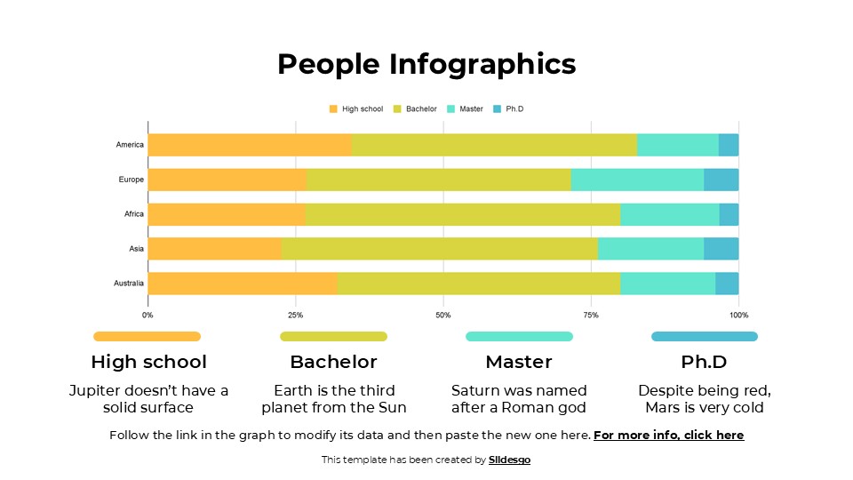
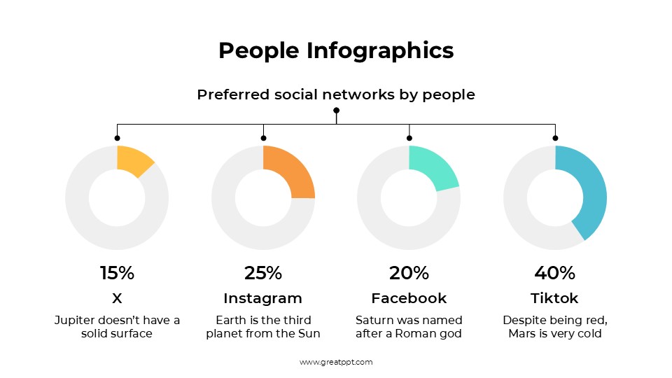
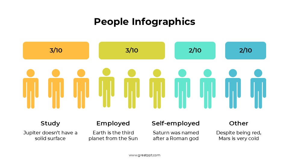
Proportional Representation: Instead of standard pie charts, use the template’s “Person-Icon Grids” to show market share or demographic splits. It’s a much more intuitive way for an audience to grasp “7 out of 10 people.”
The “Persona” Framework: Specialized slides are designed to act as “Customer Avatars” or “User Profiles,” allowing you to bridge the gap between abstract data and real-world behavior.
Modular Infographics: The deck is built as a toolkit. You can easily swap, scale, and recolor the human-centric icons to match your specific dataset while maintaining a cohesive visual identity.
Strategic Use Cases: Bridging the Gap
This is a Social Connectivity Toolkit built for the modern communicator:
HR & Internal Culture Briefings: Perfect for presenting employee engagement surveys, diversity and inclusion initiatives, or new organizational charts.
Marketing & Consumer Insights: Ideal for brand managers who need to present target audience segmentation or “A Day in the Life” of their ideal customer.
Non-Profit & Social Impact Reports: A go-to resource for showing the human impact of a charity project or the reach of a community health program.
At a Glance:
Vibe: Warm, Inclusive, Artistic, and Professional.
Best For: HR Professionals, Marketers, Sociologists, and Non-Profit Leaders.
The Toolkit: 100% editable 16:9 format with custom “People-First” infographics and a massive library of stylized human assets.
Ready to put your audience at the center of the story? If you’re looking to dive deeper into the technical side of things, I can also track down a specialized Customer Journey Map or a Global Demographics Analysis template to give your research a matching edge. Should we start building the profile?
Features of this template
- 100% editable and easy to modify
- 19 Different slides to impress your audience
- Contains easy-to-edit graphics such as graphs, maps, tables, timelines and mockups
- Includes 500+ icons for customizing your slides
- Designed to be used in Google Slides, Microsoft PowerPoint & Canva
- Includes information about fonts, colors, and credits of the resources used
Video Preview of People Infographics
Share Now!
Presentation Tips

Related Products


Same Contributor

Featured Products